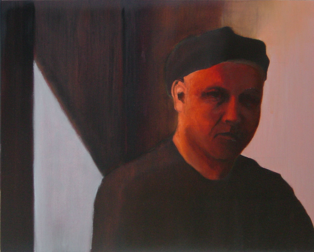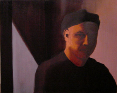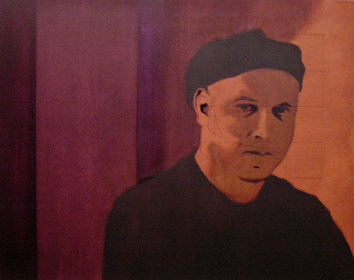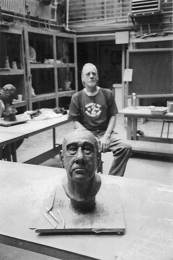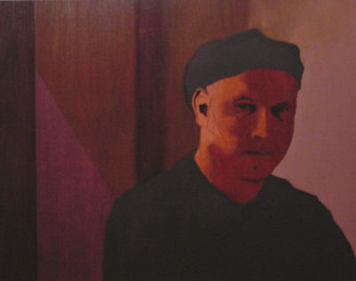
self portrait, 20" x 16", oil on panel (in progress)
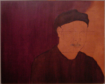
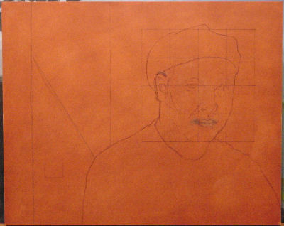
Returning to my self-portrait, I began by thinning some Burnt Sienna with turp and covering the shaded portion of my face again. I tried to dissolve the hard edges of the Ultramarine blue comprising the darkest shadows in the process. I like the warmth, but it still needs to be darker.
Using Transparent Gold Ochre (which I've never used before) and turp, I covered the deepest violet areas. My hope was that this complementary hue would deaden the violet, which I believe it did. I then covered the lighter violet areas. In this case the underlying violet served to deaden the overlaid yellow, which just made a med-dark brown. The violet and brown reminded me of that peanut butter with the grape jelly in alternating stripes. This wasn't my hope.
On a whim, I used the same Transparent Gold Ochre on my face in the transition between the shadow and light. The yellow mixed with the underlying red made a nice orange. I probably should have used Burnt Sienna instead, but this could work out. The light area of the face will actually be opaque and drawn into the transition area. So it all might work out in the end, where the yellow in the flesh, warms and darkens with the orange as it falls into dark warm shadows... or I might just have to paint over it. As I said, whim.
Then I tried to mix the color of the lit wall on the right. I made two different browns, ended up mixing them together, adding violet, then Flake White and came up with what you see. Had I known that's what I was going for when I started, I probably wouldn't have gone the same route, but sometimes it just works out that way. Regardless, I covered the area and drew it into the shadow above my head. It's not a good transition, and the bad photo makes it worse. Ideally I'll make it a gradual transition from the well lit right to the dark center with some indication
of the light even behind the left side of my neck - this should help pull my body forward from the wall while making the wall appear to be one surface driving back into darkness.
Nothing I did here was terribly exciting. Little of it will be readily apparent in the end. I caused a few problems that I'll have to fix and didn't really achieve anything that stands out as a good bit of painting. And despite the fact I don't like how it looks now, I'm pretty happy with how it's all going. Why? I think it's just because I'm painting, and (for me at least) this is what painting is like.