Thursday, July 26, 2007

Letting Go


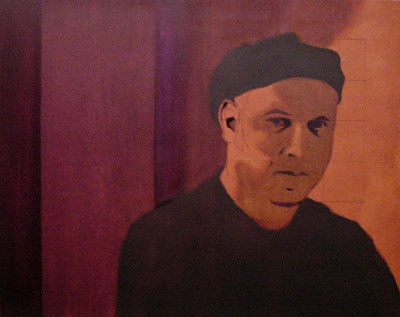
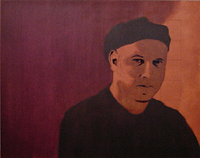
Untitled, 34" x 21", oil on panel (in progress)


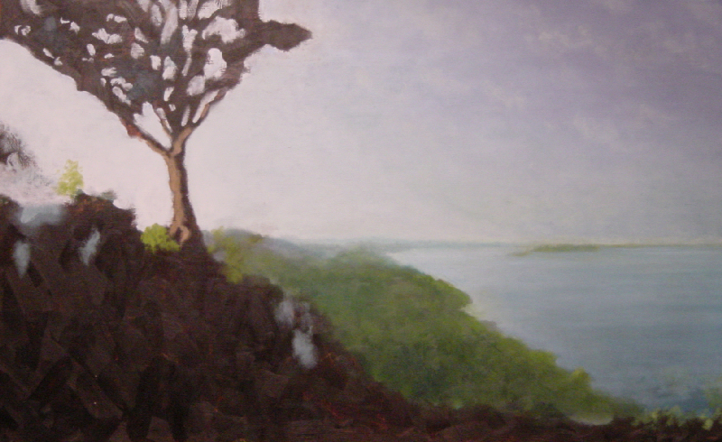
While waiting for the latest layers to dry on my self-portrait, I decided to go back to my landscape. The first thing I did was to paint over the small group of trees extending into the water on the right side. I really needed to re-establish the gradual progression of the water, and these trees were in the way. Now, I liked them quite a bit, but I was warned a long time ago about falling in love with a small part of a painting and trying to hold onto it to the detriment of everything else. Besides, I can just paint them in again later.

I also painted over the buildings and roads I had begun in the center. I plan to put the town back in, but instead of building up vegitation around the structures, I'm going to cut the city into the forest. I think this is a better approach, similar to painting trees. Instead of building up to the shape you want, you cut down to the shape you want. Why do I think this works better? I wish I knew. It just seems to be the case. Perhaps it looks less calculated because you're focusing on the negative space (what's not there) and so what remains appears more natural. Regardless, that's my plan. We'll see if it works.

It probably appears that I am backtracking. I think preventing yourself from backing up is a hazard though. Rushing to the finish, in anything, tends to achieve a product that doesn't stand up upon examination. It lacks the proper foundation time would have afforded it. I find painting to be an exercise in patience, among other virtues.

Monday, July 23, 2007

Best Intentions


self portrait, 20" x 16", oil on panel (in progress)


Not much has changed, save for the two darker violet areas. At the top of the inner area, notice how it becomes a brilliant violet? That's an example of a "good" idea gone bad. Those two areas are shadows, as you might have guessed. The inner area will gradually lighten, blending behind the figure into the lit area right of the figure. In an effort to aid this gradual blend, I thought it would be a good idea to place my thin layer of violet down and then draw it to the right with a large bristle brush. Once again, I'm thinning the paint with turpentine.

Now, turp isn't really a glazing medium, it's a solvent. So essentially I put a solvent on my painting and then applied force to it. What happens when I do that to an unprotected painting? I dissolve the previous layer AND the imprimatura right down to the white acrylic ground, and wipe it away. What violet is left over the area becomes beautifully luminescent, and entirely undesired. This was one of those moments I wish I could travel ten minutes back in time to smack myself on the head.

Once it all dries, I'll attempt to darken that area again. How? I'm not sure yet. One of the issues with this method of painting is that it's harder to correct problems when you are dealing with multiple layers of paint, as opposed to just the surface.

Tuesday, July 10, 2007

Into Shadows


self portrait, 20" x 16", oil on panel (in progress)


I've added shadows to the face in two steps (had I remembered to photograph it in-between you'd have seen them separately). First, I thinned Burnt Sienna with turpentine and blocked in the majority of my face, which resides in the shadows, then I let it dry thoroughly. Second, I thinned Ultramarine Blue and added the darkest areas of shadow. The thin layers of Burnt Sienna and Ultramarine mix to black, optically in this case. Once this layer has dried I will apply another layer of Burnt Sienna to soften the contrast and ease the transitions.

Traditionally (somewhat of a generalization), shadows were painted thinly. Thick paint is simply unneeded in these circumstances. This is not to say that shadows were devoid of subject matter, just that you only need suggest what is there, the mind of the viewer will fill in the rest.

As a result of the warm imprimatura and warm glazes I'm using, the shadows are... warm. Eventually, you will see in this painting that the lit areas are cool. This is also a fairly common occurrence in painting. Typically, the light and shade will be of opposing temperatures.

I suppose I should note that I also glazed my hat and shirt once again with a Burnt Sienna/Ultramarine Blue mixture. (I know, I need to come up with some abbrev. for these pigments, etc.)